AllTop All Zen: Launching Today

02.08.08 | Category: Interaction Design, Simplicity, Video

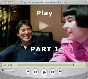
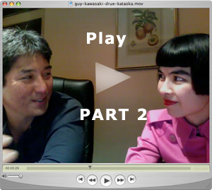
“This is where I like to come to avoid the traffic,” said Guy Kawasaki—soon after launching into a discussion of the opposite (i.e. how to attract web traffic).On the eve of the beta launch of Guy’s new site Alltop.com, Guy gave ValleyZen.com an exclusive interview about it. Click for videos part 1 and part 2 below.
Simple Concept, Simple Interface
The concept of the site is deceptively simple. Therein lies its Zen power. What does Alltop do? It is a one-stop aggregation of the most recent stories from 35 top websites in popular categories such as celebrities, sports, fashion, Mac, and the controversial category egos. More About Alltop here. The interface is influenced by “Apple Aesthetics:” light on graphics, no clutter, open white space. Presentation supports functionality. Simple & brilliant.

Proven Model
Alltop reminds me of the very early Yahoo when it was just a collection of links called “Jerry and David’s Guide to the World Wide Web.” The Old Yahoo’s traffic actually grew very, very fast (unlike the much more complex Yahoo of today). One can argue that the times were different, but I believe that part of the momentum of the early Yahoo was because of its simplicity. True, anybody could copy it (and many did), but the first-mover advantage ensured its survival & sustained growth.

I’m sure Web 2.0 Cole Porter would say Guy, “You’re the (All)Top!”

Bon Voyage!

39 Comments so far

  1. Svetlozar

    Interesting idea! Many successful companies have been built around the concept of taking a really cluttered topic, and transforming it into something very simple. Search engines did that for the Internet. Turn Inc. does that for advertising (taking heterogeneous advertising inventory and transforming it into homogenous leads or transactions through a Cost-per-Action pricing model).
    The only problem I see with Alltop is the evident lack of barriers to entry. But with Guy’s brand name behind it, the website clearly has a nice first mover advantage.

  2. Bill Fenwick

    In the days before electronic searching, one of my great frustrations was the time and effort spent on wading through mountains of unrelated material that had been cleverly titled.

    I spent a lot of energy attempting to convince lawyers, judges and courts of the necessity of text that was electronically word searchable. After 40 years the message has kinda gotten through. However, in my fervent efforts to get case law, statutes and regulations digitized and electronically searchable I overlooked what I have come to call “fall-out education” i.e. what you learn about things that are not relevent to the specific point of inquiry but which makes you a better rounded lawyer. One of my quest now is to develop a solution that would accommodate both needs. Getting people addicted to web browsing is not a good solution because of its adverse impact on productivity.

    Maybe Guy and Alltop is a route that should be explored.

  3. Robert Young

    Website looks clean and the mouseover summaries are quick and easy to digest, which helps greatly for smooth interactivity.

    This is another portal to see how well it fits in users’ interests and desires. There must be some very “in” people at Alltop to track all the latest celebrities, egos, and happening news. Keeping up with the latest will be key to keeping reader interset, to provide the user Zen in the right content with great usage experience. But how will Alltop make money?

    Not recognizing most of the Ego celebrities probably reveals my age or how far I am in keeping up…

    Robert

  4. Drue

    Excellent observations. The mouseover eliminates a step and allows a glimpse into a page without committing to a click. As for “the latest” Alltop definitely exists in the Zen now.

  5. Internet Marketing Joy

    It’s a great idea in generating lots of traffic. I think they should add more categories like home and health.

  6. Barbara

    Your post highlighted the importance of lack of clutter, a Zen favorite of mine. It provoked me to visit Alltop. I wasn’t disappointed. Following fashion and celeb news is filled with clutter, sensory overload, and in-your-face paparazzi. Certainly appreciated the white space suggestive of the hot white light of the paparazzi surrounding the text and favicons withoout the distraction of the flash. All of our favorite stories and celebs are a click away.

  7. Mari Smith

    Great interview, Drue! Love this new site and concept. ;) If I hadn’t watched the interview, I don’t think I would’ve gotten the “egos” category, though! :) I found myself looking for internet marketing, social media, new technology and the likes… mostly available by drilling down into egos. LOL

  8. Tristan Naramore

    From the interview: “What is the ‘not’?” Great question. Very Zen, indeed.

    It makes me wonder what the equivalent of white space might be in information space? There’s white space on a page or screen design, but then there’s “white space” in our moment-to-moment perceptions. What we cannot perceive surrounds and even defines what we can.

    As I walk down a street, I often think to myself, “What about this experience of navigating in 3d space is different than navigating the Web? I’m relying on visual and auditory cues and ever-changing conditions to get to my destination unscathed.” Online, we don’t have to worry about our physical well-being (except for perhaps carpal tunnel, bad backs, or failing eyesight), but we should be concerned about our psychic well-being. As Mr. Fenwick points out, “Getting people addicted to web browsing is not a good solution because of its adverse impact on productivity.” There’s a lot more I could blather on about, but best I stick to the thread…

    Alltop’s layout reminds me of a printed newspaper, or the directory of a large building. It lets the eye forage (“scan”) for enticing bits of information quite effectively. I like the balanced density of information, which doesn’t overwhelm with inessential meta-data (like posting dates and control widgets). The navigation strip is innovative: It is positioned near the bottom of the screen, thereby underpinning, rather than containing, the site contents; its fixed position (ie does not scroll) ensures easy access plus consistent branding; and it’s translucent, which is just cool :-)

    This one’s going in my Bookmark Bar.

  9. M.Slavin

    In the world of the web – May I have the envelope please. And the winner is Zen. Zen. Zen. Zen wins it all. Great job in the videos. In this household viewing your videos and blog is getting more prime time coverage then that comedy refereed to as our political race.
    Everyday I go to your blog it’s like I’m entering as whole new adventure.
    By the way I’m bookmarking Alltop too.

  10. Katrin

    Really enjoyed the interview, Drue!

    With an abundance of sites about every imaginable subject, it is very helpful to have one site giving you fast access to the main addresses.

    I like the clear, uncluttered design – no stress for the eyes in Zen fashion.

  11. NEENZ

    My first visit to this site was to listen to your interview. I’m moved by the concept of the intersection of Zen and technology. Great questions with Guy, especially the “What is the ‘not’?” A question we should all ask ourselves frequently.

    Subscribing because something inside of me has been moved.

    http://www.faleafine.com/?p=39

    Aloha,
    NEENZ

  12. Jonathan

    Very cool design. Same question as Robert–how is it going to make money? If advertising (see-google adsense) fills the page, or banner ads for that matter–the site will be way less zen (more cluttered). One of the FAQs is regarding advertising on the site…where does the it go?

  13. Jeremy Pepper

    Love the site, Drue.

    Not much of a fan of Alltop’s “Ego” page – mostly because outside of this small circle, no one knows those people. There are bigger egos (and better thinkers) out there that could be on that list.

    And, yes, some of those people are friends and I am offended for them. And, some of those people I know, and are not worthy of the ego claim or to have the publicity.

  14. Interview with Guy Kawasaki, Launch of Alltop.com « evolution

    [...] Looking at the site, it’s beautifully designed, with a consistent, clean layout, and an Apple-esque feel about it. Guy also talked about the site on ValleyZen. [...]

  15. Jeremy

    Very Feng Shui. Sometimes less is more. Especially in digital space where replication is infinite.

  16. Drue

    Mari — Glad the video enhanced your initial experience of Alltop. Let us be your ValleyZen guides to all things ValleyZen :)

    Tristan– Another in-depth comment from you—visual, haptic, and kinesthetic

    Katrin — Yes–with so much competition on the web for human eyeballs, these gentle organs appreciate an oasis of Zen when they encounter it.

    Neenz — Glad the concept of the intersection of Zen and technology resonated with you. An intersection is a NOT space as well, neither one thing nor the other, the space in between.

    Jonathan — Great questions. What would you suggest for the monetization?

    Jeremy Pepper– In true Zen fashion, speak your mind. I’m sure Guy welcomes the opinions swirling about this controversial category :)

    Prof. Bailenson — In one line, you deliver depth and meaning. This is profound. I look forward to hearing more about your view of the ZEN of Virtual Reality from your standpoint.

  17. Borcho

    Nice site. I like the design, although I started off by looking for a search box!

  18. Leslie

    AllTop is just gorgeous! The negative space you mentioned was the first thing I noticed, and it really is calming and makes what color is there stand out beautifully. And, most importantly, that very clean interface just looks so organized–which is exactly what AllTop is. I loved the mouse over previews and that translucent bar, which also made me think about how much work must have gone into that clean and elegant design. (“Tiffany, Brooke, and Trixie” can kiss my butt if they don’t like it!)

    And I’m all for keeping it as uncustomizable as possible. After finding my iGoogle had reset itself for the third time, I’ve given up!!

    On the downside, AllTop is in danger of keeping me from ever getting any work done ever again….

  19. evolution

    Not only is Alltop beautifully designed, but it’s refreshing that it goes against the mould and doesn’t go with the current bubble of user-generated content like everyone else – that really makes Alltop stand out for the likes of iGoogle and NetVibes.

    I’m glad it’s not customisable because with custom sites, you don’t get a wide variety of topics and sources, as usually you only add the feeds that you regularly check.

    I was reading some really funny comments about the footer. http://tinyurl.com/2uz8sl

    Like art, some people clearly don’t get this zen-like feature. I haven’t seen any other sites that incorporate this :-)

    But, the blogosphere is what it is – there are just some people who love to bring others down and will find something negative to say, no matter what you do – but when you reach a state of Zen and inner peace, that negativity doesn’t mean very much!

  20. Ruhi

    Drue,

    Thank you for visiting my blog and for leaving a link to the video. I really like the way you got Guy to talk about the Business Model and the general designing of the website. As mentioned in my post, I really like the content and the white background, which makes reading very easy. However, I don’t think that the floating strip is a very good idea. It has no functionality and it’s tad annoying.

    Evolution- Thanks for that link to my blog. I feel that I’m entitled to my opinions and I don’t need to follow the crowd. It’s not that I like to “bring others down”, as you put it. I can see both the good and the bad.

  21. Drue

    Leslie- Like your comment about the work behind clean and elegant design. Effortless beauty springs from discipline and passion. Now we’ll wait to see what Trixie and co. think :)

    Evolution – Thanks for entering a Zen mode with us and for bringing Ruhi’s discussion about the footer to our attention. I haven’t seen a footer like this anywhere else either.

    Ruhi – Appreciate what you say about Guy and the business model. Was great to hear him peel back the top layer of Alltop and share the genesis, as well as his goals and concerns. There is a certain immediacy in the video shot in “ONE TAKE” and on the eve of the launch.

  22. Think like Guy Kawasaki or fall behind in the FUTURE of news sites | New Media Bytes | Online journalism, web production and promotion

    [...] is precisely why Kawasaki’s borrowed model can work. Says Kawasaki to ValleyZen: Our market is people who don’t know what NetVibes and iGoogle or My Yahoo – dont know what a [...]

  23. Joseph Weir

    Matt Drudge should take a leaf out of Guy Kawasaki’s book and adopt the “mouse over” technique. I love Alltop and it has taken the top spot in my bookmarks. Thanks Guy.

  24. A Taylor

    It is good to see Guy Kawasaki actually walk the talk. Many VC’s dont practice in real life what they preach to entrepreneurs seeking funding, guidance etc…but guy with Truemors and know Alltop does practice what he preaches.

    Also, this blog has a great clean design and focus Drue and Bill. Will look forward to gaining much future insight from
    Valley Zen

  25. Thomas Han

    Hi Drue,

    Thanks for the behind the scene interview with Guy. It’s nice to hear what his thought are and how he came up with alltop.com.

    Thanks!

  26. Sjors

    must say a category as mac looks a lot like this (2 year old) site: http://apple.originalsignal.com/

  27. shawn smith

    Hi Drue, Great interview. It really helped me put alltop.com in perspective and even spurred some talk in my office. Interesting angle you are going after and I really like it. Thanks for the messages too, I like how you engage your blog readers.

  28. Analysis on Guy Kawasaki’s Alltop launch: A Gimmick Site with Marketing Flair

    [...] Guy’s Self-Contradictions lead drama This wasn’t the only case, as Guy contradicts himself with his recent post on how we can forget about the A-listers (yet launches a website promoting them) Drue has a fiery video, where she pins Guy against the wall for his inconsistencies off camera. [...]

  29. BA Hellman

    This was a great post by Valleyzen and a fun video interview to watch. However, it is important to remember that web projects need to remember that less is more and work to provide users with only useful information, which is what I’m working towards on nobosh.com.

  30. Community Guy - Jake McKee » Rapid Fire - Monday, February 18

    [...] AllTop All Zen: Launching Today Speaking of Alltop.com…. This is an interesting interview with Guy Kawasaki about the launch of Alltop. [...]

  31. Brent Terrazas

    I originally posted an article about it on my tech blog – http://www.addto10.com
    But what he’s really missing is an advertising section.. the closest thing we have currently is theadfeed.com, which is pretty old/outdated…. hopefully he’ll consider that as a new section… right now he’s adding SEO blogs… so who knows…

    Great interview, and by far you win for having some of the best comments…. spread the gospel! Alltop is here!

  32. TechCrunch Censors Alltop Post

    [...] a less than flattering post on Guy Kawasaki’s Alltop. (To learn more about Alltop, check out the video interview I did with Guy on the eve of the launch of Alltop beta.) TechCrunch has removed the post, as twitterers and [...]

  33. Jcyreus

    Drue – I just watched your video segments with Guy. Entertaining and insightful (even if it was a flat out plug for the Alltop launch). I’ll be interested to see how many of my non-techie readers of Jcyreus dot Com interpret and either adopt or reject Alltop. Personally, I still think it is a great idea for the target market that they are going for.

  34. Two months later…

    [...] video interview with Guy Kawasaki announcing his new venture [...]

  35. Internet Marketing Jonny

    I like the concept of alltop.com. Thanks for the video interview as well to backup your post. It was interesting to watch.

  36. Kelly

    I know this post is old news now, but I thought the interview was fantastic. Most of these “video interviews” are so incredibly boring. Thanks for at least being entertaining and informative. Saved my brain!

  37. Bill Fenwick & Drue Kataoka

    Thanks Kelly

  38. Bill J.

    Yip, have to agree with Kelly above. I’ve seen so many boring video interviews, and with slower internet speeds in my country, it can take ages for the video to load. This one was worth it though.
    Thanks a lot.
    Bill Jenkins

  39. EB

    i had watched this video and it is one of the best video i had ever seen.

Leave a Comment